Prediction is the New Visualization
AUTHOR
Frank Corrigan

There is nothing better than a data visualization for making you think of the questions you had forgotten to ask.
If you work in supply chain, there's data visualizations everywhere you look; a chart, a graph, a map. They help you see things that aren’t immediately obvious like relationships, outliers, or longer-term trends. They help you ask the questions you didn’t think to ask in the first place.
The Evolution of Data Visualization
Looking back, the earliest visualizations were maps (well-known examples from the 1800’s are below). These were hand drawn and demonstrate how powerful visualization has been for a long time. Without the computing technology of today, they must have taken a lot of planning and a lot of time to construct.
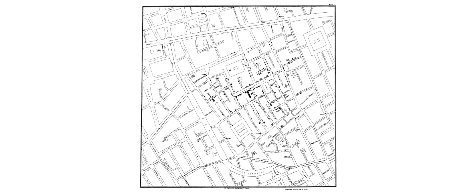
Original map made by John Snow in 1854. Cholera cases are highlighted in black, showing the clusters of cholera cases (indicated by stacked rectangles) in the London epidemic of 1854. The map was created in order to better understand the pattern of cholera spread in the 1854 Broad Street cholera outbreak, which Snow would use as an example of how cholera spread via the fecal-oral route through water systems as opposed to the miasma theory of disease spread.
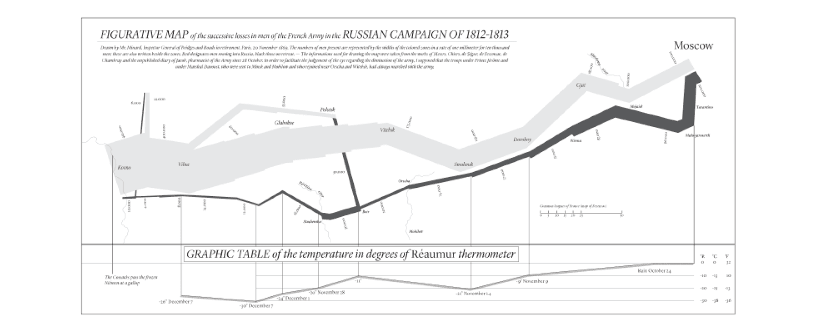
This map, drawn by French engineer Charles Joseph Minard, shows Napoleon’s disastrous invasion of Russia in 1812, three years before the Battle of Waterloo.
The Rise of Data Visualization Tools
Fast forward to 1990 when data visualization was a bit easier but still heavily underutilized. The capabilities for building them was limited mostly to statisticians (using tools like SAS, SPSS, MATLAB, or R). As more analysts adopted Excel, through the 90’s, and eventually Tableau in the early 2000’s, visualizing data for insight became easier and much more popular. The speed of production exponentially increased.
One well-known paradigm shift in the realm of visualization was Hans Rosling’s Gapminder tools (circa 2005). Hans reshaped a global narrative when he released and championed this interactive and dynamic tool.
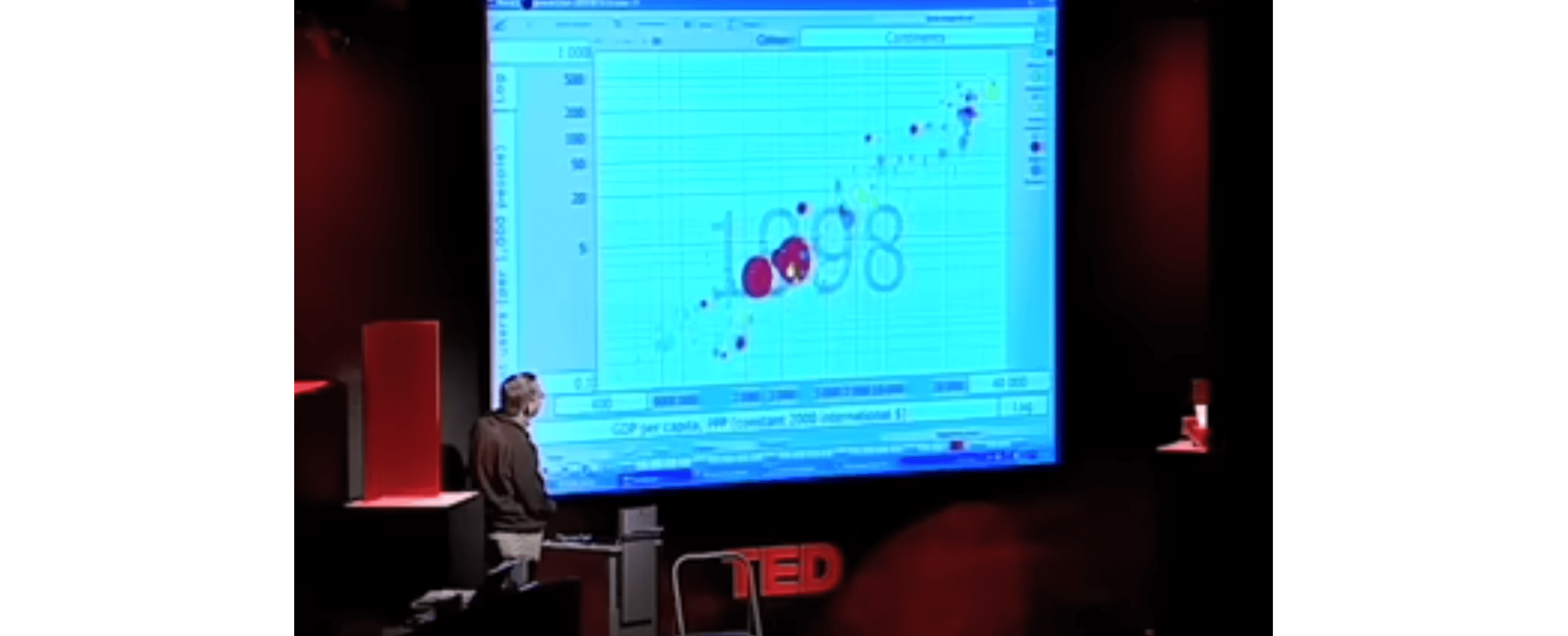
The best stats you've ever seen | Hans Rosling
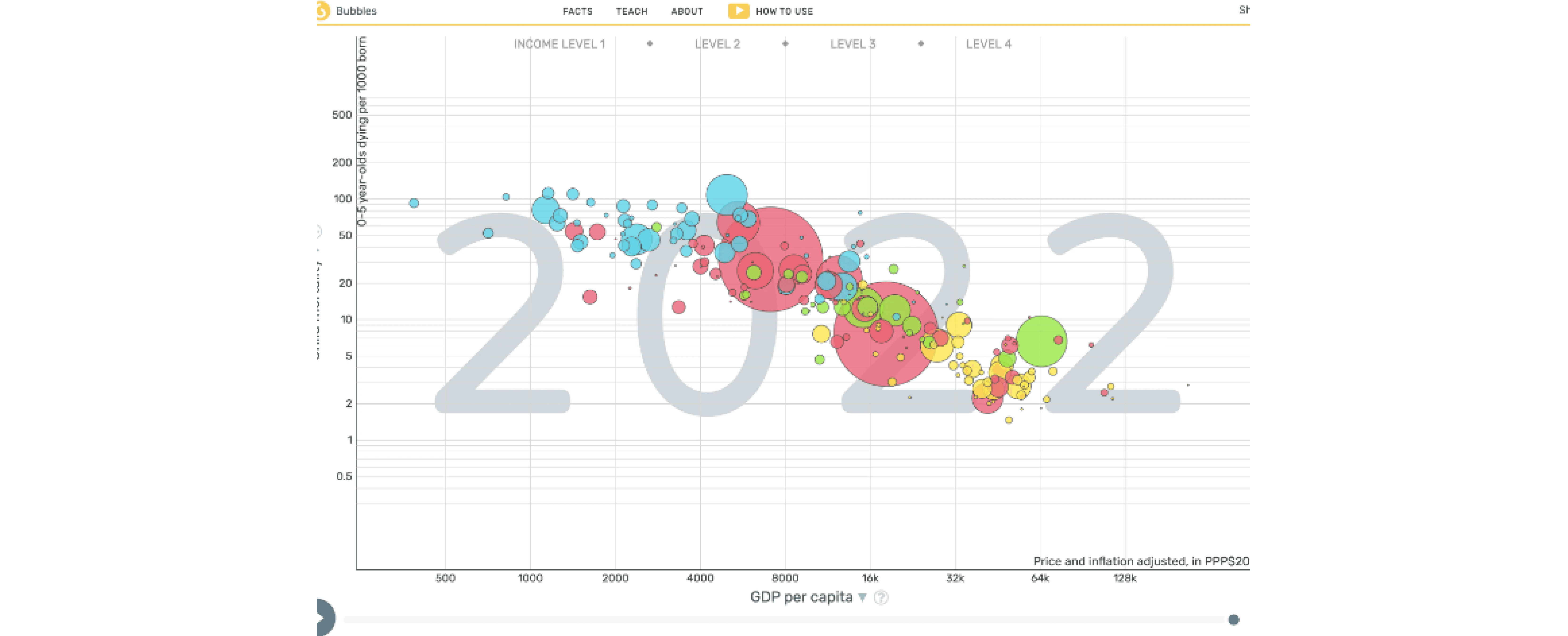
From Gapminder.org, not your ordinary scatter plot. Each bubble represents a country (sized by a variable like population size). It also visualizes how the relationship changes over time
2024: The New Standard for Data Visualization
In 2024, data visualization is now common practice across the supply chain. Nothing brings a conversation together like a well-crafted chart or map. And the ability to easily build charts at a breakneck pace makes it possible to find insights in the data and create visualizations that help teams make decisions.
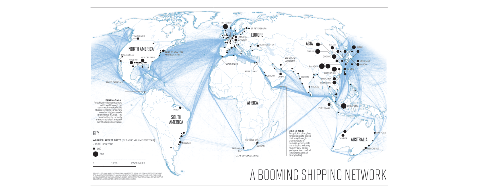
World Shipping Routes
The Shift to Prediction in Supply Chain
Supply chain teams that use data visualization in 2024 are no longer ahead of the curve however. It doesn’t provide any competitive advantage anymore. Where should organizations be looking next? The new data visualization is prediction.
Even in 2024, many supply chain leaders say their teams are more reactive than proactive. How can this be true in the third decade of big data? It is because the “Excels and Tableaus” of the prediction world are only now being brought to life.
Demand forecasts have been commonplace in supply chain for decades. Basic year over year and time series methods have been the widespread default. Demand forecasting has gotten much more sophisticated over the past decade though. The adoption of better algorithms (decision trees and neural networks) combined with advances in computation have led this new wave. You might even go as far as to say that advances in prediction have already been embraced for this part of supply chain. But what about outside of demand forecasting?
A lot of potential for prediction in supply chain - like visualization in the early 1990s - remains underutilized. These use cases are far less common:
Predict KPIs like cycle time, OOS, fill rate, or labor callout (further reading)
Predict preventative maintenance for machinery, equipment, and vehicles (further watching)
Predict dynamic pricing for services provided or purchased (further listening)
Predict optimization model inputs like unload time, capacity demand, or transit speeds (more to come in a future post)
The Current State of Prediction Modeling
One big reason for this is because we are still in the “cholera and Napoleon’s invasion” ages of prediction modeling. Prediction models take a long time to build (well) and only a small subset of people have the skills to make them. Luckily, we are now coming into our “data visualization 2000s” inflection point. More people will be able to generate reliable predictions.
When more people are able to generate reliable predictions, teams have good comparison points to help optimize their operations. One of Malcom McLean’s favorite expressions was ‘if you don’t have something to compare, you don’t have anything.’ His analytical mind was always comparing one thing to another; that allowed him to find inefficiencies and opportunities. Consider KPI performance like cycle time. What do you compare it to when planning for the upcoming day, week, or month? Maybe it’s last week's performance? Or maybe it’s year over year (YOY)? It is true, with last week and YOY, you do have a comparison point; but it’s a suboptimal comparison point. Is last week similar to this week? Is it really apples-to-apples? Sometimes, yes. Often, no. Supply chain analysts can now build really granular and reliable prediction models for more precise points of comparison.
The Future of Prediction in Supply Chain
At Lyric, we believe creating reliable, robust, granular predictions is at an inflection point. To date, the ability to do this resembled how creating data visualizations was prior to 1990. It took a lot of time and a specialized skill set. So statisticians had to be very intentional about the visualizations they wanted to create before they started. There might have been 9 other things they wanted to look at, but they had to be intentional given their constraints. Then Excel and Tableau showed up so the statistician could build all 10 visualizations to get all these different perspectives. Prediction is at this same inflection point today.
The ML Workspace in Lyric democratizes the ability to find signals in your data, and use them to build prediction models that, like a data visualization, make you think of the questions you had forgotten to ask. This is the next step toward operational excellence.
Conclusion: Making Predictions in the Supply Chain
Connect to your data, let Lyric find the best model configurations, and deploy to make ongoing predictions that fuel all kinds of decisions your organization makes on a daily basis.
Bottom line? You don’t have to be a PhD data scientist. You don’t have to pick just 1/10 projects you want to pursue. You can generate reliable models quickly and produce predictions that finally help your supply chain team discover their own inflection point from reactive to proactive.
Are you ready to make your first prediction model? Let's do it together!
Read more
Generative AI meets Time Series Forecasting
May 2, 2025
Deb Mohanty
read more
The Dying Art of Supply Chain Modeling
Apr 15, 2025
Milind Kanetkar
read more
Tariffs, Trade Wars, and the AI Advantage: Why Fast Modeling Wins
Apr 7, 2025
Lyric Team | Prime Contributors - Laura Carpenter, Victoria Richmond, Saurav Sahay
read more
Lyric Leverages NVIDIA cuOpt to Elevate Supply Chain AI
Mar 18, 2025
Sara Hoormann
read more
The Technology Behind Modeling at Scale
Mar 14, 2025
Ganesh Ramakrishna
read more
Our Dream is to Make Every Supply Chain AI-First
Oct 18, 2023
Ganesh Ramakrishna
read more
What Is a Feature Store Anyway?
Mar 14, 2024
Sara Hoormann
read more
Supply Chain AI Ain’t Easy
Feb 20, 2023
Ganesh Ramakrishna & Sara Hoormann
read more
Four Ways to Improve Supply Chain Operations with Machine Learning
Jan 26, 2023
Vish Oza
read more